
as in she blogs.
no wonder she's better than all the rest.

word emily
w o r d

thanks nelya for the tip off

as in she blogs.
no wonder she's better than all the rest.
word emily
w o r d
thanks nelya for the tip off

Age: 30
Hometown: Portland, Ore.
Raised in rural Oregon, Emily says she developed a creative nature because her family often made their own clothes and reupholstered their own furniture. After graduating from the University of Oregon, Emily moved to New York City and studied design at Pratt Institute in Brooklyn. Described as charming, hard-working and having a fun sense of fashion, Emily soon found work as a design consultant with several world-renowned designers and stylists. Eventually, Emily’s talent and style, which she says is a mix of classical and contemporary design, led her to start her own business as a prop, lifestyle and tabletop designer. Today she is an in-demand photo-shoot stylist for top lifestyle and design publications and national retailers.
ok.
i love that her family made their own clothes and reupholstered their furniture.
and please, not in an aww-isn't-that-cute, they-were-poor-way...but in a wow, people-like-that-generally-tend- to-be-more-awesome-than-people-who-buy-shit-in-stores-and-have-no-taste-way.
for real, look it up.
but i see the stylist here and not the decorater/designer..

i think we can all agree this girl definitely has a good eye and has potential...


it's simple.
but this "portfolio" reads photo shoot for a stylist. which is ok, if that's all the work she's had.
i mean compared to turds 1, 3, 4, 5 and 6 she's like donkeyfarts ahead of the curve.
i have high hopes for turd #7.

i feel like i have seen all of this on design sponge.
thoughts?

this tard/retarded business has gotten out of hand.
i am not coming from a place of hate or ignorance. just humor. promise. while i still whole heartedly believe in my gut that calling someone a designtard is not at all offensive to retarded people, i am also a mother and i am willing to bet that if my child was retarded i would most likely not use the word tard.
truth is, gentle and not so gentle readers, MFAMB is conflicted in a big bad way.
part of me, the artistic part, says fuck all of you. and the other part sees through your eyes.
more truth? no sleep for me last night.
and when shit weighs this heavy on me i have to fix it. make it right. make it better.
i swear if i opened one more email telling me i was making fun of retarded people everywhere i was gonna hurl my computer/blackberry off a very tall building. and maybe myself behind it.
i got to thinking that this whole designtard series actually started as the design TURD series (no really, look it up there on the side). but back then my blog wasn't as popular. not too many people were commenting. this time it is a bit more popular. meaning i am reaching more people, more mothers of retarded kids to be exact.
i think you see where i am going with this.
i cannot continue calling these design buttholes, tards. not in good conscience.
i realize that some of you alternatively might be offended that i backed down from this. that i gave in, as it were. and in a way, i'm right there with you. but i also know in life you have to choose your battles. i have a 5 year old, i think i know this better than anyone.
it is just a word after all. but a word that apparently hurts. a lot.
i am not that person.
but i still want to say FUCK YOU to people who came here to berate me with mean words. you can choke on my dick! this is not for you. this is for the people who have had to hear that word in regard to someone they love and watch them hurt for it. no fucking way am i going to perpetuate that sickness.
and to you all i want to say i am sorry.
but....
i am still here to make sure that these TURDS come correct in the world of design.
and i fully intend to draw all over their faces if i need to.


Age: 29
Hometown: Santa Ana, Calif.
Julie, the youngest of five siblings, was raised in an environment where excellence was expected. Although her parents wanted her to become a doctor or lawyer, she wanted to follow her dream to become a designer. With a bachelor’s degree in interior design from The Art Institute of California, this self-described overachiever and socialite says that her favorite projects involve designing spaces for nightclubs. Julie, who says her design style reflects a “modern global glamour,” loves to work hard and play hard. Because of her looks and petite frame, Julie believes that she is often underestimated and must be “bossy and direct” in order for people to take her seriously. She says she’s not afraid to speak her mind and hopes that winning HGTV Design Star will prove to her family that she is a legitimate designer.
i think her family might be on to something...
 i am a fan of color but these colors clash to me. also that fucking student art project on the wall is making my butt bleed. and if there's one thing i hate most in the world of bad design it might just be the use of tchochke for the sake of filling an area. like those fucking twine balls!!!!!!!!! that shit is just dumb and not good dumb. the bowl would have been enough and a few books and the candles. otherwise it looks like a model home set up for potential buyers.

 never a fan of chocolate and red. never ever. and the use of an egg chair doesn't save the space from looking pedestrian.
 again with the stupid design school art project.
pedestrian. boring. no personality. i could do better people. where was my phone call to join this shitshow?
 from this pov the color combo looks nice. it looks like lavender, chartreuse, and gray..which is kinda pretty. but no..the rest sucks too much. that granite sucks and so does that slate floor. together it's double suck.
fuck you poop door.
 i can't reiterate myself anymore...with the pedestrian, boring, personality-less decor of these spaces...

and for the record personality doesn't equal shit glued to the wall...
love the curtain fabric though.
 i think what i am discovering about design school is that they are teaching people to go shopping and fill a room.

i'm out of words. you go...
i will defend this girl now slightly.
in her bio she says her style reflects "modern global glamour". ok i can whole heartedly and confidently say that there is nothin glamourous or global about her design A.
but girlfriend can decorate the shit out of a club....
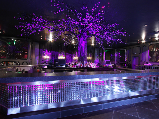

tacky it's true. but fun.


Age: 30
Hometown: New York, N.Y.
As a child growing up in rural New York, Michael knew he had a natural artistic talent and loved to find creative ways to play a game or rearrange his bedroom furniture. After earning a degree in interior design from The New England School of Art & Design in Boston, Michael moved to New York. His persistence and creative design style, which is “a natural approach to urban sleekness,” helped him land a job with a prestigious hospitality design firm, where he produced award-winning work. Today, Michael is a design business owner and credits his outgoing personality and problem-solving skills to his success. He says he grew up as the star in his family and believes that the combination of his competitive nature and outspoken personality will help him become the next HGTV Design Star.
oh really michael??
well let's take a look at your "award winning natural approach to urban sleekness"...
 that bedding is causing my butt to explode diarrhea..
 perfect for a corporate hotel stay..
 this room lacks focus and it's far too crowded with shit.
take the cowhide off the futon thing, a few less pillows in softer colors, take the encyclopedia collection off that table and replace with a few well placed pieces of pottery or shiny pretty things, take those fucking suitcases to the closet and make that gallery wall a little more spaced out...the room is cramped enough why do you need to cramp up the art?...fuck off.
 not understanding the pillow and/or the izod bedding...
 this guy needs an art hanging lesson. also whats with the 4 tables/stools? and just please for the love of bret michaels get one big rug. and stop putting shit on an angle. it's very hgtv of you.
 these light fixture things are in the photo above. i don't hate them, i think in the right space they could be cool...for a guy...in the city...is this the urban sleekness portion of his design aesthetic?
 just no!!!!
those chairs...gag...table..double fart gag..i do love a riddling rack for wine holding though and the light fixture is cool against the rustic quality of the rack..but that's it you fucker!!
 sigh.
sigh.
so very very hgtv. mandace's penis just grew a little bit bigger.
 oh look...shit's on an angle again.
 just changing the color on the walls and taking those fucking throw pillows off the bed would make this room 100 times better. also change the curtains, blanket, and chair fabric. it's all too similar. there is no depth or anything interesting to look at. nothing to keep your eye moving around the room.
 better.
the reds, browns and yellows are really my least favorite colors together but the basics in this room are great. a few color changes, some books and personal effects and we could have a winner.


fact: sweater dresses make my butt throw up diarrhea.
Age: 35
Hometown: Chicago, Ill.
While growing up in Detroit, Stacey says that she was captivated by her parents’ vast art collection. She believes that the early exposure to art strongly influenced her love of design and sparked the development of her own creative voice. After graduating from Columbia College of Chicago with a degree in journalism, Stacey completed the interior design program at Parsons The New School for Design, where she refined her self-described “eco-friendly modern” design style. Today, it’s no surprise to Stacey’s friends and family that she owns a successful design business or that she’s competing to become the next HGTV Design Star. They say that she puts 110 percent into everything she does and that when she sets a goal, she achieves it.
i think stacey's work is boring. that's what i think.
this contemporary style can look too catalog if not done right.
i know there are a vast majority of people who think this look is awesome. but i feel like if you own a west elm or a CB2 catalog you too can acheive this look without a parsons school of design degree..
i still think this girl will go far in the competition..
 bathroom=blech
 change the fabric on those chairs to maybe a softer, rounder pattern and add some art or an antique-y mirror and this room would look a lot less cold and a little more personal..
 that light fixture sucks and so does that tile! that shit already looks dated.
 is this a west elm catalog shot???!!
i do like that pillow on the left though.
 **snore
 better..
 better still...
this girl has potential.
i hope she can figure out that a little "old" injected into a modern space works a shit ton better than all new and/or eco..
thoughts??
