as a magazine junkie i have been known to wait outside the barnes n noble for the ups guy to deliver the boxes of "crack" early on a tuesday morning. i know some of you (all of you?) feel me here. we need our magazines, they feed us, inspire us, give us fodder for our blogs etc.. so despite the fact that the best magazines have died (domino, cottage living) i think most of us still hold out hope for the existing ones to get their shit together and give us good, new, inspired design. yeah, yeah...i know diff'rent strokes arnold...BUT, from where i sit the magazine world is fucking B O R I N G. par example...the october issue of house beautiful made some big claims; they told us we would never tire of great details...true HB but the example you gave us of the chicago townhouse looked like every other house i've ever seen in your magazine...(snnooore). and was that detail or over styling?
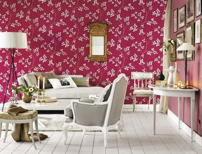
then you preached to me that i'll never get tired of blue...well that's bullshit b/c last year i WAS tired of blue..although i am loving it again..but i am loving the dark mysterious blues, the almost black blues. and blue in doses not everywhere. the blue you give us of the east hampton house is just too much blue!! it's everywhere...the couches, the walls, the rugs, the accessories...it's so blue it makes me want to punch blue in the face! and don't even get me started on the pink and green room. i think my problem with you these days HB is that i want the houses you feature to be roughed up a little, they are all so perfect...who lives like that? no one, that's who. and it never looks attainable. but then you told us we'll never tire of quality. that is true and the house you featured with that silk koi pond wall covering was amazing! paired with that dark blue (and fuck you for not making the images available!) was incredible. and that french limed oak sideboard..i nearly passed out. don't get me wrong, this house was just as luxuriously unattainable as the others but it wasn't so overly fussed out that i felt i couldn't replicate it somehow. and then you told us we would never tire of keeping it simple...true dat. at least for me that's true. the house below is what you gave us for the simple scenario...


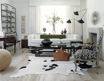
simple, yes. but also a little dull and lifeless.
and then you told me that i would never get tired of tuscan. umm...i didn't know i liked tuscan HB, probably b/c i DON'T!
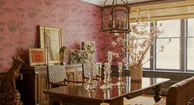
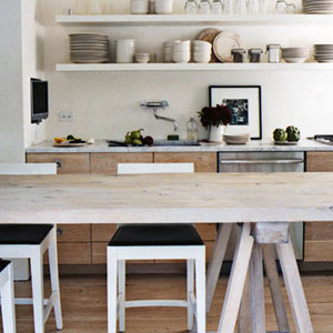
now, moving on to the other popular shelter mag out there,elle decor...usually guilty of the same unattainable style as HB. but somehow this issue was the better of the two..i think b/c of interiors photographer simon upton's place. a gorgeous industrial loft bathed in white but roughed up with exotic treasures gathered on his travels. mixed styles of slip covered furniture and modern chrome and leather dining chairs. lots of textiles draped over everything....eye candy! and it was interesting, not predictable.
another winner was this house:
it belongs to the dudes who run anthropologie and urban outfitters. (way to have your finger on the pulse of the majority of your readers margaret russell-btw when is top design coming back on? i need it so i can make fun of it here)


this place was so unpretentious and chic. well done. don't start the bj's just yet though elle decor...you have been known to bore too just as HB has been known to deliver...so if i were you i would keep that finger on the pulse and pay attention to what these here blogs are saying..we are doing the research for you...for FREE i might add!
don't worry i will still buy you (and sadly, love you b/c of my addiction) b/c living etc, inside out, vogue living australia, and Canadian H&H are expensive and don't come out as quickly here plus they're fucking foreign so the sources are usually pointless. but as punishment every time you deliver us bullshit i will call you out on it.
(sticking my tongue out)

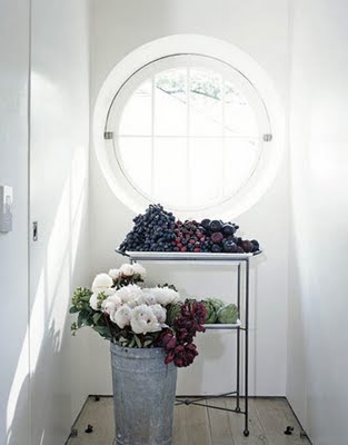
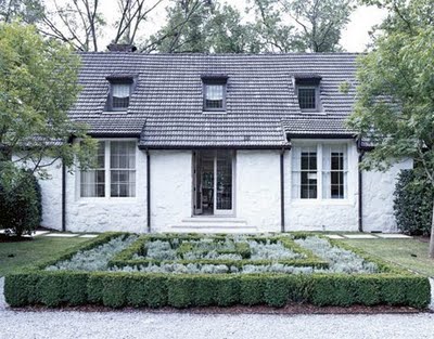 while searching thru house beautiful's piss poor website i managed to find (by complete accident i might add) this stunningly and simply decorated house. i love it. first of all the front is so clean looking and refreshing. talk about curb appeal. i'll bet it's equally gorgeous in the winter.
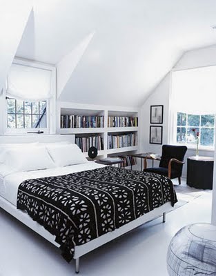
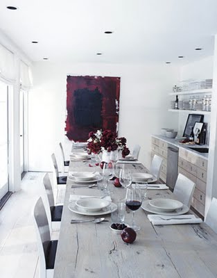 and this room:
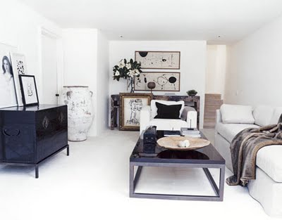

 perhaps my favorite room in this house and the sole reason i kept clicking to see more...this office:
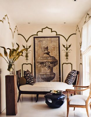 imagine working in a place this lovely..sigh...
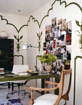


 i know yesterday i said too much blue is not the greatest...but the above makes me question that sentiment. it's so pretty it's glowing.