
 i love the layout of this house. it seems like a common enough house but made to look expensive and elegant. the room above is sparse and interesting. ill defined. i like that. i am also liking the white walls and creamy off white trim
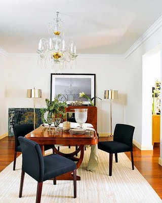 i would cut off a finger for those shiny lamps up there..i really and seriously would.
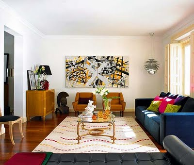 and here is an oddly long room but the use of all the furniture on the outer edges of the room and the bench placed in the middle makes good use of the space. in a long room like this you can really change it up and do lots of little "areas" too. although placing the table smack dab in the middle is a little strange simply b/c it's so far away from any seating area. i think (i hope) this is for the sake of the photograph. in fact, the placement of everything in this room is probably due to the needs of the photographer. oh well, still pretty.
images nuevo estilo
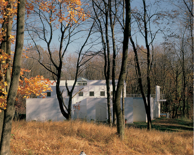


 and with windows and views like that....what's not to love?


