it is evident in this weeks fartparade that vern, mandice and narcolepsy (aka genevieve) are really just turd eating zombies who love murals. gene narcolepsy reminds the losing turds that at the end of this clownshow "one of you will become ONE OF US."
let me explain what that means.
the winner of this poop will go on to star in a show that highlights diy crafts, paint by numbers murals, taking perfectly good outdoor spaces and turning them into contrived sets based on several musical instruments. among other terribleness. awesome. where do i sign up?

here's the rundown for all you lucky people who don't have to endure this dreck.
the turds met on a trump roof where a bunch of embarrassed jazz musicians had to sample their instruments so the turds could choose which one would serve as inspiration for an outdoor room.
then OF COURSE they had to combine instruments to work together.
these challenges are getting stupider, if that's possible.
anway..
here are the turd/instrument choices:
courtland-cello
dan-guitar
tom-sax
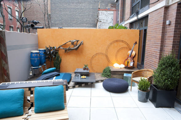
michael-tromboner
alex-congos (bongos? is there a difference?)
emily-tuba
casey-xylophone
nina- french whorn
trent-keyboard
stacey- strumpet
got it??
dan gets moved to the girls team and he seems to be the calm, sexy force the girls need to keep them from eating each other's faces off.
 (dan "drill me" faires)
the men spy a giant bamboo day bed that would be perfect to represent alex's chosen bongo drums.
but sadly when they try to get it in the elevator it won't fit.
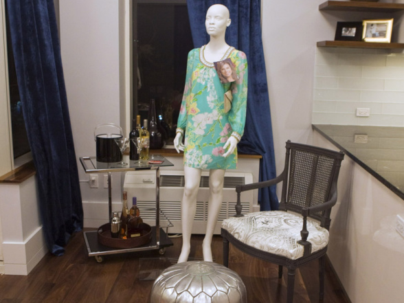
so instead alex chooses to forgo the main seating as his representation and goes all literal and gets two round, blue ottomans. way to think outside the bongocongo.

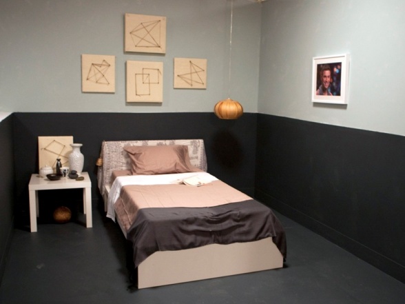
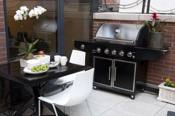
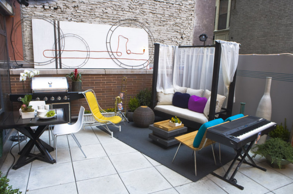
cut to truckerhat trent buying some christmas trees for the space, cuz nothing says keyboard like a christmas tree. courtland and michael are trying to sing christmas carols as a passive aggressive hint. but trent just can't get on the court-michael gay train cuz it's going too fast. it is cramping his straight, truckerhat style.
nothing says straight man like a trucker hat and keyboards.
and nothing says keyboards like a grill.
unless you do like i used to and pretend to play the grill like it is a keyboard and you are nick rhodes of duran duran. then i am all over that shit! air keyboards are the best!
next up is courtland and his sedona arizona venetian plaster cello inspired wall of sweet potato puree.
that's like saying here is my belgian wallper inspired cheeseplate!!
back on the girls team..
dan is hard at work carrying plants for stacey..

watching emily's boobs...
 overall just being a sexyface..
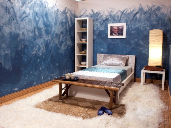
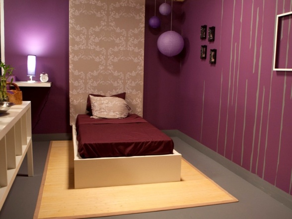
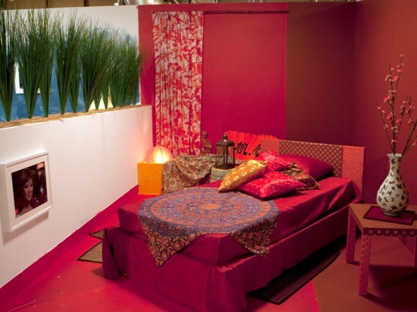
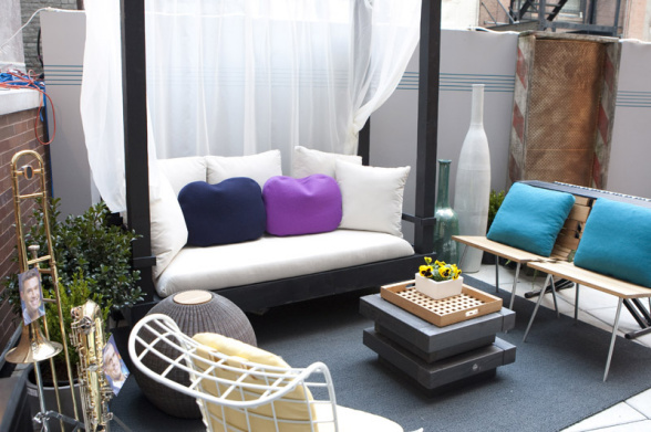
i'm pretty sure he's the reason for nina's snail trail mural..
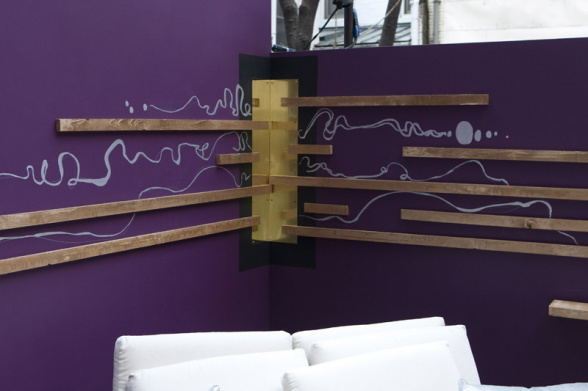
she tells us that a french whorn is "deep, dark and brassy". (so is my vagina coincidentally)
emily tells us she "hates" the snail trail mural.
i do too emily. it's contrived and stupid. but so are those fucking slats.
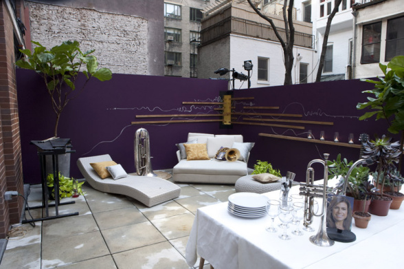
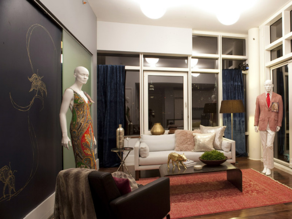
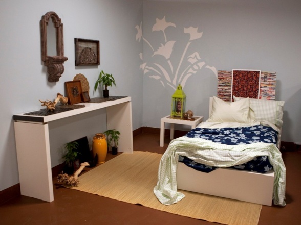
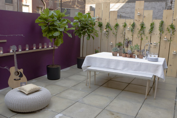
the only bit i liked in this space is the long table with the white tablecloth and potted plants.
back over at camp gay the guys are hard at work putting together this bullshit:

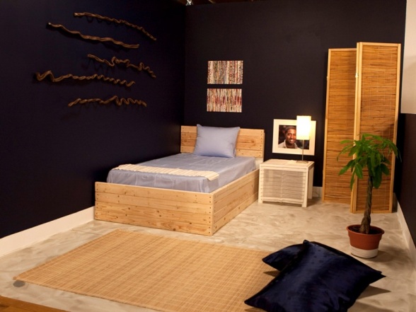
you knew at some point homeslicer would put up those extension-cord-and-a-lightbulb things he's famous for back home.
but then when you find out that nina and her snail trail won!!!!!

well, then that's when i head straight for the medicine cabinet and a healthy dose of horse tranquilizer.
as in neither of these rooms were good.
so the bottom two were bongo alex and trucker hat trent with the keyboard grill.
both of their host performances were terrible.
mandice's penis shrank, narcolepsy didn't see it bc she was sleeping and vern shot laser acid out of his eyes at everyone.
just before the judges were about to announce which turd was going to be flushed trent had something to say.
it went like this:
" since i arrived i have only contributed a few wooden palm fronds and a grill. there are too many chatty kathy's over here and they are making me want to crawl inside my trucker hat and go to sleep. i can't be inspired by their gayness. i need a calm environment to be creative. this whole process is too much like a game show and i hate all of you and your ass faces!"
to which vern replied:
"what a coinky-dinky. we can't see you and your palm fronds being good enough for a prime time show.
(pointing zombie finger) NOT ONE OF US!!!!!!!!!!!!"
you're better off trent.
trust.
besides go back to 30 rock.
its a MUCH better show.


sticky vagina trails forever!!!!!!!!!