the winner

after a long battle in my head i have decided that the buffet will be painted farrow and ball's hague blue:

it is the perfect shade of sapphire-ish-peacock-y-mysterious blue. it will get 2 coats of oil based high gloss love. below is someone's bureau painted in hague blue. you love it too don't you?


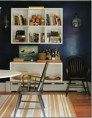
here is a room painted in hague blue. it is almost black and most likely would read black at night. i love that aspect of it.

gran thinks it's a kick ass choice!

so now i must find the perfect pulls and hardware bits....sigh. i have no idea what i want.

pottery barn has pushed a button

somehow this room appeals. nothing makes me want to pull my eyelashes out more than an over styled bed but i was able to overlook it this one time. back when MFaMB was a young girl in the 70's this is the bedroom my neighborhood bestie had and i loved it. while i was swimming in a sea of red shag and pink walls covered in posters my neighbor was living in a pure blue, yellow and white botanical heaven. something about this room SCREAMS at me to shut my eyes and remember the good ole days. the clean, plush low pile carpet, the silence and frosty cold of a good air conditioner, the matching white bedroom set with all of her tchochkes (including but not limited to a silver brush, mirror and comb set, several well placed unicorns, kitten bookends holding the entire judy blume collection in place and a music/jewelry box with a twirling ballerina) and us sitting on her perfectly made bed discussing what we were going to do that day.

if fiona asked me for this bed i fear i would have to give it to her.

can i get a little help here?

project buffet makeover is well under way here at the andrews-anderson house. however.


i can't decide on paint. i WAS going to go with a glossy white but decided it was too boring. why not add some brightness to my dining room? i am thinking of 3 colors but just can't commit. i need my readers to help me.
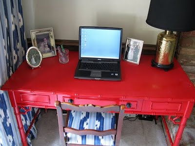
i saw this image over on i suwannee via matters of style. and while a petite bamboo desk and a huge, chunky buffet are drastically different, i DO enjoy that pop of red in a room. i just don't know if an EXPLOSION of red is in order.
i am also madly in love with all of these midnight and peacock blues i am seeing everywhere. shiny and dramatic and moody blue? can you picture it? my fear with this is it will be too dark and not translate as well and be..well...too heavy? what say you?
i am also thinking yellow, like this ikea cabinet/buffet. i am open to any suggestions and images you might have. help me.
hey...nicolas bb...what do you think?

sidenote:
i feel it is my duty as a design blogger to explain why someone who claims to have impeccable taste would have such a hideous chair. let's just say that when we went to look for a chair the room it was intended for was a bit on the cabin-y side. i thought this chair would look nice next to the entire wall of brick fireplace. and really at the end of the day it's not the fabric its the chair's lines that suck.

sorry

a while back i had some richard cranium aka dick head playing a "i'll have the last word MFaMB!!" game with me on my blog. so i added the comment moderation...i showed them!!!
well, i just noticed that i had a whole SLEW of comments from my sweet and awesome readers that i had not moderated and that makes me sad. i love my readers and their comments. even the douchey ones. so if you are/were a MFaMB reader and noticed that one or more of your comments hadn't been published i am very very sorry. i have taken comment moderation off so that i don't have to deal with all of that stuff anymore and so no one feels like i don't care about what they are saying. i will just deal with the mean comments the way i feel works best...with a knuckle sandwich.