 this company makes these based on a picture of your pet, such as...
real beeru:
 pillow beeru:

real che:

pillow che:

real opie:

pillow opie:

babies love them:
real titi:
pillow titi:
real titi:
pillow titi:

this company makes these based on a picture of your pet, such as...
pillow beeru:1. What's the first color you see in the morning?
benjamin moore's silver satin or the orangey yellow of my wood floor, depending on which direction i am looking.


8. What color was your living room when you were growing up?


17. What color depresses you?


 it's all in how you use it i guess.

this house beautiful color personality quiz is supposed to tell you something about yourself. i guess it tells me what i already knew..i enjoy the cool colors more than the warm. have you taken the quiz?
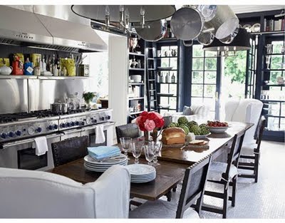
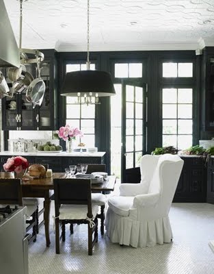
 as is her eat in kitchen. that stove is killing me. the midnight blue wall is awesome and the stove's knobs match it. oh..windsor!!!!!! the marble hex floor tiles just about send this kitchen over the edge of toomuchmoneyforyourowngood cliff.
 tell me, if money were no object would you not have this kitchen?!?

that pink reminds me of circus peanuts. that is a good thing. it's called pink begonia by b. moore. 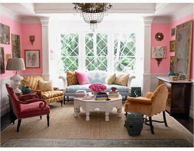


 black walls and glossy black trim for the game room. yes.


 later windz! your house is DUMB!!!!!
 have any of you watched this show? then you probably understand that we are dealing with a bunch of design retarded individuals. so you know, i don't claim to be a designer or even a decorator and unless i go into business as such i never will claim to be. but i do know that i have great taste and a good eye so that if i wanted to i am sure i could be.


 you should know that those are place mats he has thumb tacked to the wall as a headboard. and the window "art" was painted freehand by mr. designer. and why in god's name would you get rid of that fabulous bed only to replace it with some jacked up wooden frame and place mats?? i don't think that bed could get any more "sophisticated princess". why not paint that motherfucker instead? and seriously, you couldn't find 300 dollars in your 5000 dollar budget for some fabulous window treatment??? so instead you went with the ghetto graffiti?
 was it this built-in nook that sucked up the budget? hmmm....i'm confused jason, where in the high water of hades did that 5000 dollars go? it certainly didn't go toward paint since it's the same fucking paint that she started with.
 yes this room most likely cost more than 5,000 dollars but you could find a great faux fur blanket almost anywhere nowadays for a couple hundred bucks, zig zag rugs at west elm are affordable, that bench and art could be found at a thrift store, target sells a pretty awesome tufted headboard, you might have to splurge on the light fixture and ghost chair but all in all a cheaper version of this room is attainable if you know what in the fuck you are doing.
next up is lonni "deer in the headlights" paul.

 ok, so it's not terrible. but it did read little boy as opposed to almost 18.
 she made cutouts to look like bases. ok. kinda cool, i guess.
 much more sophisticated color palette and instead of rock albums those could have been blown up images of baseball cards of his favorite players. done. 5,000 could have gone into some really cool modern furniture that he could take with him when he moves out...IN A YEAR!
moving on:


 complete with mdf cave cutouts and stupid dinosaur decals. seriously where did these fucking budgets go to?!?!?! and while i appreciate the photocopied kid cut out why in fucksake did he chop off his legs? and why does a 5 year old need a flatscreen in his room?
 again with the cutout bullshit and primary colors. and why does every goddamned wall have to be a different shade of blue? and why so literal?

here's dan "of mice and men" vickery.

he had an 8 year old environmentalist who wanted an eco friendly room.


 i know what you're thinking...DID THE ENTIRE BUDGET GO TO THAT BAMBOO FLOOR??? YOU REPLACED HER PERFECTLY GOOD WOOD FLOOR WITH AN ECO FRIENDLY WOOD FLOOR? IT ALREADY WAS ECO FRIENDLY YOU DIP SHIT! IN THAT YOU DIDN'T HAVE TO FUCKING REPLACE IT!!!!
 take vintage or thrift store pieces and repurpose them. DUH!! fucking rainman.
dear christ, last but not least...
here is torie "gross redneck" halbert.
her client was another young girl, 11-ish i guess maybe younger. loved art and the colors red, blue and green.
here is the before:


what about something like this instead? a nice tiffany blue in small doses with little pops of red and green in the form of pillows and small accessories? if she likes art why not give her a parsons table against a wall with like hundreds of dollars worth of art supplies and cheap frames for her to frame her SHIT UP!!?!?!?!
how 'bout this gorgeousness this morning? i have gathered (humbly so) the yummiest gray and white decor the interwebs has to offer. i believe everyone needs a little gray and white in their home. AND!!! you can throw any color in the mix and it still looks good. so go ahead all you white wall lovers (that would be me), throw some charcoal up on the walls and behold it's awesomeness and then pat yourself on the back for being so brave. you won't be sorry. 


 pillow nicolas???
