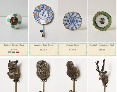
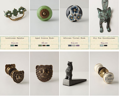
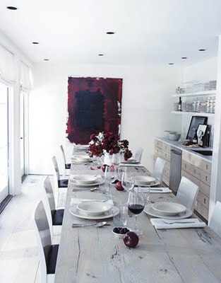
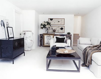
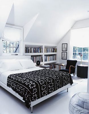
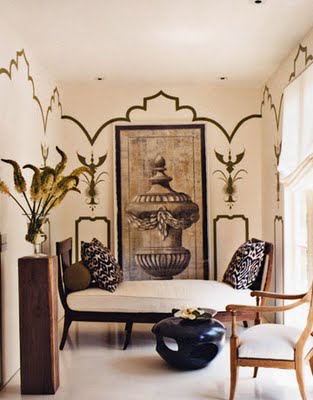
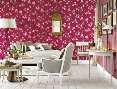
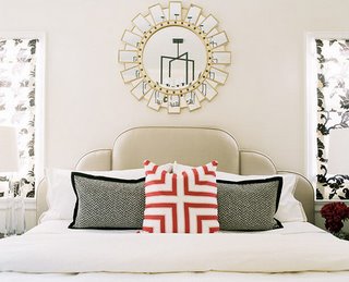
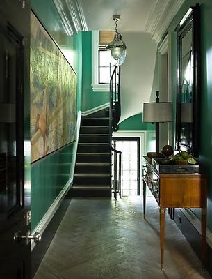
the following are the types of things that can distract me from just about anything...
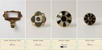
i can sit and imagine on what these lovelies would adorn for hours...especially the plaid ones..a big, glossy black chest of drawers a la the badgley mishka country house, perhaps.
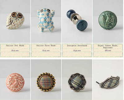
things for you to consider for me...
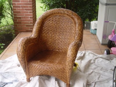
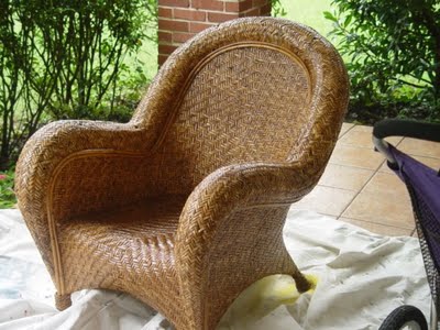
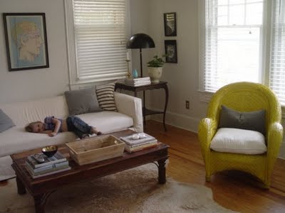
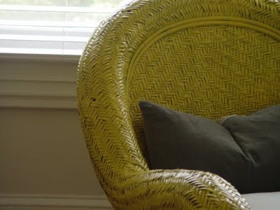
i was unable to get started on painting my buffet over the weekend, because of the monsoons here in atlanta we were pretty housebound. but i did decide on a whim that this chair (which i don't love but until i can afford or find what i do love, it's a place to park your ass) needed to be painted yellow. and i had some yellow so a'painting i went. 

here it is in the room...


what do you think? i think it kinda looks like mustard. and i was going for a more sunny, lemon-y yellow. i think this is due to the color of the original wicker underneath. yes, i should have primed it but i am terribly impatient. so now i am thinking yellow in general is not working in this room and that i should keep the palate a little more soft and neutral with maybe a pretty bluish gray, like a dior gray. also considering black. and white. what are your opinions? i really need them. don't be shy.


news
atlanta is being washed away...
and
she is asking her readers to submit questions for her to ask ms. russell. i of course submitted the question, when in the fiznuck is top design coming back on? why don't you email ronda and submit the same question?pretty
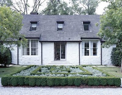
while searching thru house beautiful's piss poor website i managed to find (by complete accident i might add) this stunningly and simply decorated house. i love it. first of all the front is so clean looking and refreshing. talk about curb appeal. i'll bet it's equally gorgeous in the winter.
gorgeous:


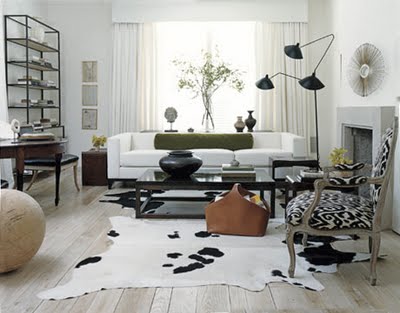
and this room:

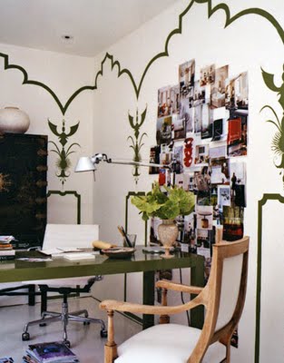
perhaps my favorite room in this house and the sole reason i kept clicking to see more...this office:
this is taking a small, oddly shaped room and doing something really cool and unique to it without the use of over the top, cheap looking gimmicks. just the simple trompe l'oeil in the same green as the parsons desk. it's SOOOO GOOD!!!!! it's a "why-didn't-i-think-of-that?"
imagine working in a place this lovely..sigh...
monday color combo
happy monday readers. i love gray. you do too, i know cuz you have told me. i have color combo'd it many, many times. here, here and here. oh and here. this combo of RED and gray boders on too 80's to be good. but..BUT it can be pretty. as we have seen in previous posts gray can pretty much rock any color. and with red i think the gray tempers it. and on the flip side of that red can bring some life to the coldness of an all gray room.


i know yesterday i said too much blue is not the greatest...but the above makes me question that sentiment. it's so pretty it's glowing.