
 if this were my little cupboard...
it would be my safeplace.
it would be what i would imagine in times of great pain...like childbirth.
it's where i would go to gather myself after a long day of reading nasty anon comments.
it's where i would go when i wanted to throttle my daughter.
or husband.
my happy place.
house of ill repute
well hello! welcome to the cougar den. at least that's what i call it...i've heard neighbors call it the whore house, but i pay them no mind...come in come in...let me get you a cocktail..
sit down here on my circular sofa while i go pour the drinks...warm your toes by the fire will you? don't mind my shoes and ombre robe..i was just getting comfortable.

i'm back..did you notice your reflection in the shiny, copper pendant light? that's on purpose...ha ha haaaaaaa ha haaaaa!!!
we can stay on the circular sofa or we can go in here and watch something on my flatscreen? do you like 70's porn? i do.

sometimes i'll sit here in the nude and tickle the ivories..
if you need to tinkle here's the bathroom. does the portrait turn you on?


in the morning i'll make donuts and coffee....

if you need to tinkle here's the bathroom. does the portrait turn you on?
here's the bedroom. i have a circular sofa in here too and a flatscreen. i love to come in here and watch jake gyllenhaal movies all day long. look! one's playing right now! do you wanna put on my high school band uniform?
what? my initials? CG? oh..haa...no...that stands for Cou-Gar. you can spend the night if you want. twilight is on on demand in HD.
in the morning i'll make donuts and coffee....
3 eating scenarios and a project
i love a good dining area. this is an important home location. this is the place we eat, break bread, chat, entertain with food and drink and sometimes even have serious discussions about homework and reality tv. a good dining room always catches my eye, not as much as a good living room, but close. anna spiro's dining room is amazing. so fresh, happy and inviting. not an ounce of pretense...except for the boobies...maybe a crumb of pretense there. and i love a good boob. in any case...i would be extremely pleased to eat here every day. 
here's another that pleases me. it's small and cozy, modern and rustic with that crazy reclaimed wood table. and i am a H U G E fan of a metallic light fixture. and hello swan chair, would you like to make out? this area is small, eat in perfection. 
and this space is just a big excuse for a party! i mean, the space itself seems like one of those basement kitchens in a giant english estate. the table looks like the biggest drafting table ever and paired with the loooooong bench and jacobsen chairs what's not to love. it's great and i want to have a long, leisurely lunch here and then go on a fox hunt. tally-ho!

and this next pic is what i want to do to my fireplace wall. and that is paper it.
this is my fireplace. yes, i KNOW it's dark as donkey balls in here. and the wall is gray. ralph lauren forde abbey to be precise. i struggle constantly to find that perfect piece of something special to hang above the fireplace. i went to the scott antique market and looked at giant gilt mirrors a la jenny lyons' fireplace mantle but there was nothing there under 1200 dollars that was the appropriate size. and that's what i really want. but i cannot afford such a thing. so i thought why not paper it like the photo above? what are your thoughts? any paper suggestions? i don't need a lot just enough to do this one wall. the tiles are kind of pinkish coral, a lot like puke actually. but this is a rental and i cannot control the tiles. but i will paper the hell out of this wall and never look back.

this is my fireplace. yes, i KNOW it's dark as donkey balls in here. and the wall is gray. ralph lauren forde abbey to be precise.
i struggle constantly to find that perfect piece of something special to hang above the fireplace. i went to the scott antique market and looked at giant gilt mirrors a la jenny lyons' fireplace mantle but there was nothing there under 1200 dollars that was the appropriate size. and that's what i really want. but i cannot afford such a thing. so i thought why not paper it like the photo above? what are your thoughts? any paper suggestions? i don't need a lot just enough to do this one wall. the tiles are kind of pinkish coral, a lot like puke actually. but this is a rental and i cannot control the tiles. but i will paper the hell out of this wall and never look back. images anna spiro, ??, melanie acevedo, probably dti and then me
untitled
 i love the layout of this house. it seems like a common enough house but made to look expensive and elegant. the room above is sparse and interesting. ill defined. i like that. i am also liking the white walls and creamy off white trim
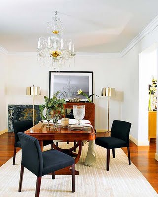 i would cut off a finger for those shiny lamps up there..i really and seriously would.

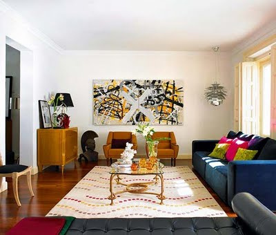 and here is an oddly long room but the use of all the furniture on the outer edges of the room and the bench placed in the middle makes good use of the space. in a long room like this you can really change it up and do lots of little "areas" too. although placing the table smack dab in the middle is a little strange simply b/c it's so far away from any seating area. i think (i hope) this is for the sake of the photograph. in fact, the placement of everything in this room is probably due to the needs of the photographer. oh well, still pretty.

images nuevo estilo
rock the vote bitches!
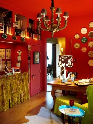 go HERE and vote for valorie's southern colors...valorie hart is a champion for the small blog just starting out and she is cooler than most of us combined. you have until midnight to vote over at apartment therapy's color contest. valorie is in the lead but only marginally so please don't let marjorie's coconut cream pukefest beat valorie's bold new orleans shotgun coolness.
*sorry marjorie, i'm sure you're real nice but val's my girl.
country behemoth
i have never been a fan of these big, modern houses. they look sort of like a cold museum to me. don't get me wrong they are beautiful...just not home-y. i like home-y. but something about this one in this setting intrigues me. it's like country mouse and city mouse are having a party. 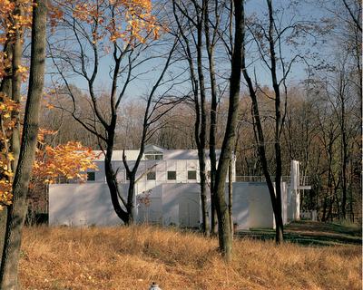


 and with windows and views like that....what's not to love?