
at least it will be when you hear this. this is my all time favorite christmas song and christmas doesn't officially begin until i hear it. no one and i mean NO ONE GODDAMMIT can sing this song like celine.
watch her hear the "angel voices" at 1:34 and then listen to her drop the heritage bomb at 4:29-4:36. chills.
L O V E
no...it's not lady gaga.  now do you recognize?

how 'bout now?

it's the almighty A-Lam. aka adam lambert. and i love him. in all his gorgeous homosexuality.
he is as pretty as any woman and his voice is DUMB! and you KNOW he would totally make out with girls. rest assured i would be standing in line for that make out session. and i would walk away all glittery and reborn.
designtard graduate school
well hgtv have released their design monkeys (not you boss..you're too cute to be a monkey..unless you're a finger monkey) on yet another uninspiring dream home. first off i am not a fan of the southwest architecture. not because it's ug, bc i don't go for that sort of adobe modern barren landscape sort of thing. i'm a tree girl, deciduous tree girl and lots of them everywhere and i like houses with a sloped roof...BUT i can appreciate good design. and this house is pretty predictable. there are some good bits and i will tell you what they are (yes, tell you)...

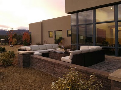
certainly you cannot argue with the view. it is sweeping. even with it's lack of trees. and bushes are NOT trees.

this is a lovely entrance. pleased that they chose the warm white. 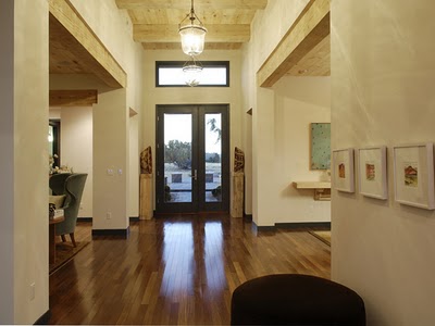
the cork walls are cool. and that's where it starts and ends.

this might be my favorite bit. they have this labeled as a meditation room/exercise room. it is very peaceful, from what i can tell. i would not meditate in it though unless you call drinking an entire bottle of wine meditating. and i would not exercise in it unless you call sitting in that chair and warming yourself by the fire exercise.
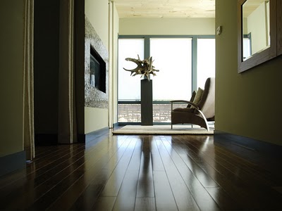
meh...
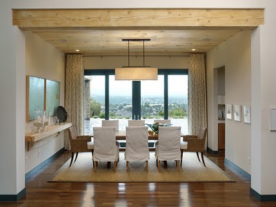
barf:
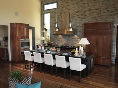
and the funny thing is i KNOW this appeals to a lot of people. much in the same way "tuscan" appeals to a lot of people. probably the same people. poor bastards.
this must be some sort of butler's pantry or something. it's ok, but the styling is so boring. in fact i ultimately believe that a better stylist could have taken every single room in this house to another level. stupid 3 plants.

here is the master bath...it's ok. just hating the tub. it seems to me with all of that money they could have afforded something a little more original. like this. and yes, i see that you can access the tub from the bathroom AND the bedroom. big fucking deal. just more hgtv gimmicks at play. i would have rather had a better tub.


here is the master suite: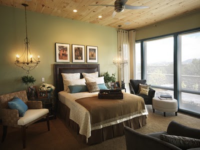
the view is saving my life here b/c without it i would most likely commit suicide if i had to stay in this room. way to go design team! was it on purpose that the wall to wall carpet matches the bedding?? wow! that's awesome. were you drawing on the sand for inspiration?

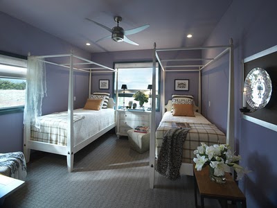
this one isn't bad either..but it's a kids room and it is very hgtv. you know it was killing them that there is no theme...so there was probably some compromise with the design team and whoever else is responsible with the toy story crap everywhere. srsly! i have a kid and even her in all her beautiful almost 5 year old wisdom would say.."mommy?? why is there so many care bears everywhere?!" exactly fiona, exactly!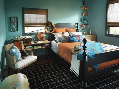
here's one of the guest suites inspired by boutique hotels. inspired is a lofty word for what this room is. it looks like a cheap hotel and i am SURE it was no where near cheap to achieve. sad really. who puts tiles behind a bead? stupid people that's who. this room already looks dated. fuck you room!
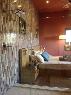 yes, that IS a shower right next to the bed. well that explains the tile. what if you were sharing a room with grandpa and trying to nurse a hangover in that bed ..while grandpa was in the shower? old saggy balls is what.

 was there ever a more hotel looking vignette? stupid 3 vases of flowers. stupid coral walls. was it the sunset that inspired this palette? opposite of awesome.
yes, that IS a shower right next to the bed. well that explains the tile. what if you were sharing a room with grandpa and trying to nurse a hangover in that bed ..while grandpa was in the shower? old saggy balls is what.at least the febreeze luminary will cover the smell of your throw up...oh wait..IT smells like throw up.
was there ever a more hotel looking vignette? stupid 3 vases of flowers. stupid coral walls. was it the sunset that inspired this palette? opposite of awesome.nothing says cozy guest room like a tv mounted in the corner...i know i know..you can watch it from anywhere!!!
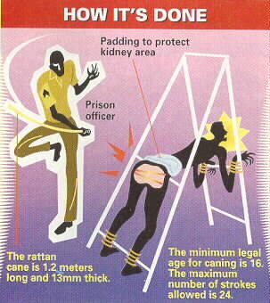
whoever is responsible for this needs to be caned. have you anything to add?
jesus franklin
let's face it- would we enjoy christmas as much if lights weren't involved? and i am obviously referring to an eye raping of lights, not an overhead. it's what makes christmas pretty. behold the true CEO of christmas:


 so i for one would like to say thank you ben franklin, without you there would be no fucking christmas. ok, and you too baby jesus. but even you must admit that without lights the nativity wouldn't be as beautiful...

ladylike


can we as a design blogging community just get back to this already??
images via we heart it, DTI, emma bridgewater melamine bowl, john derian pansy tray
in a rental if something sucks you should change it
i hated that ugly pink marble tile so i got some pretty wrapping paper from sam flax and taped it up. tape is the most ghetto thing i could have used, i know. but it's only temporary. and if it starts to peel away i will fix it with spray adhesive. quite honestly the whole time i was taping it up there i was thinking there is no way this is going to work or look good. but it does. 
here is the before:

here is the after: 
and yes, it's a little wonky but it's less noticeable in person.
and yes, it's a little wonky but it's less noticeable in person.