


retro hollywood glam goodness! from the website of redmond aldridge. (robot voice) lady boner actualized.

so, i broke down and watched the antonio project, much in the same way one watches an episode of the biggest loser. you know, sort of with pity and glee? anyway, hgtv gave fang one final makeover to complete...his own house...
 yeah, that's his bedroom. that "thing" on the wall is something someone made for him...one of the "custom" jobs he requested. it's based on a tattoo he wanted but instead made it into a headboard (?) why all the black fang? it's not "tough" as you stated..it's heavy and paired with that red is just too 80's and cold looking. the throw on the end of the bed is quite nice though and helps this room tremendously. a rug would have helped too. another "custom" piece were those nightstands. where you took a perfectly nice white piece of furniture and "metal flaked", "shadowed" and "airbrushed" the shit out of it making it look like something you'd see driving down the road in the barrio.
and there was no living room to speak of..just this huge table, 2 "thrones" and a lot of erroneous candles.

the kitchen:
the bathroom looks like a spec bathroom. not like something a so called design star would do. plus it's not finished. i mean at least dan would have gayed it up a little with a window treatment and a plant...SOMETHING!!!

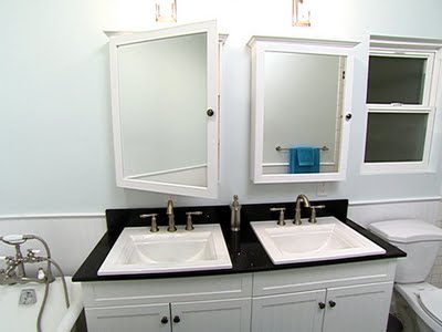
 i know it looks baby blue, but it's really bluish gray. promise. i like it. but your opinions are cherished so let them flow.

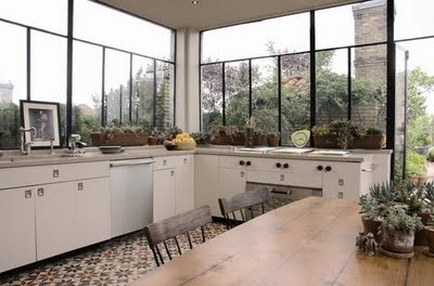 let's really consider those windows for a moment. look at them. imagine a summer storm or a winter one for that matter...heaven. plus it looks as though there is a door leading onto a kitchen garden or something awesome with 2 chimneys.
found via design addict in new york.
the following are the types of things that can distract me from just about anything...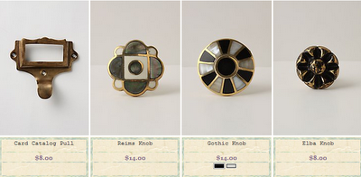 i can sit and imagine on what these lovelies would adorn for hours...especially the plaid ones..a big, glossy black chest of drawers a la the badgley mishka country house, perhaps.
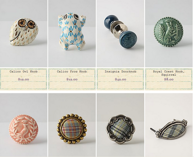
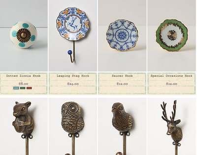 those woodland critters are fabulous. they could add a much needed touch of whimsy to an otherwise seriously modern space.
but perhaps my MOST favorite is this african violet knob. i love it intensely:
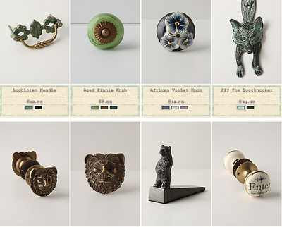
these graphic black and white animal pulls are great too...
high fives anthro.
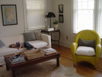
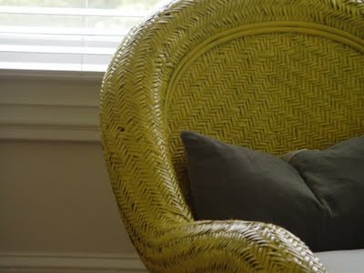
i was unable to get started on painting my buffet over the weekend, because of the monsoons here in atlanta we were pretty housebound. but i did decide on a whim that this chair (which i don't love but until i can afford or find what i do love, it's a place to park your ass) needed to be painted yellow. and i had some yellow so a'painting i went. 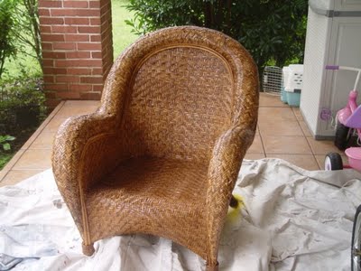
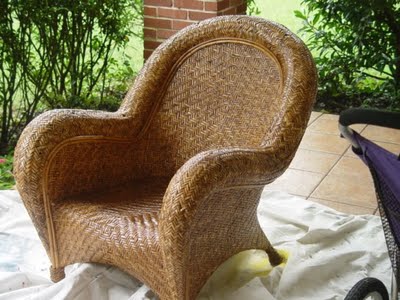


atlanta is being washed away...
and
 she is asking her readers to submit questions for her to ask ms. russell. i of course submitted the question, when in the fiznuck is top design coming back on? why don't you email ronda and submit the same question?